“In everyday life, the Flaw of Averages ensures that plans based on average customer demand, average completion time, average interest rate, and other uncertainties are below projection, behind schedule, and beyond budget.” – Sam L. Savage, 2009 – The Flaw of Averages
“Variation is the hard reality, not a set of imperfect measures for a central tendency. Means and medians are the abstractions.” – Stephen Jay Gould, 1985 – “The Median Isn’t the Message”
“Essentially, all models are wrong, but some are useful” – George E. P. Box, “Empirical Model Building and Response Surfaces”, (1919 – 2013)
“Remember that a model is not the truth. It is a lie to help you get your point across.” – Sam L. Savage, “The Flaw of Averages”, 2009
“You are allowed to lie a little, but you must never mislead.” – Paul Halmos, mathematician, (1916 – 2006)
Last week I read an article about yet another tool showing the ability to produce CFDs (cumulative flow diagrams). Maybe you’re already a user of one of these tools that help you visualize your workflow, and generate them for you automatically (or “automagically”) as part of reports they provide. Or, perhaps like me, you still generate them mostly using MS-Excel. Either way, have you wondered just a little about how a CFD works?
As most do, this article displayed a line extending vertically between “stages” on the CFD (or workflow processes, as I often call them) and identified this distance as the WIP (work-in-progress) on a specific date for the respective stage (or stages) of interest. There was also a description of another distance, a line extending horizontally between stages of interest on the CFD and identifying it as the “average lead time” for the requests (work items) arriving on a specific date. That is, the average time for a request (work item) to “flow” through (arrive into and depart out of) one or more stages of interest. Lastly, there was a description of a sloped line, as a mean delivery rate of requests (work items) flowing into or out of a stage (workflow process) depending on viewing the workflow upstream or downstream. Note: for more on the basics of reading a CFD, see this earlier post here.
A Difference Is Not An Average, Right?
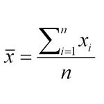
It is easy to understand that WIP is simply a “difference” between two counts on the CFD and represents the number of requests (work items) at a point in time. Similarly, seeing the slope as a simple rise over run calculation of a number of requests per unit of time (a rate over a period of time of interest) is not a complex concept to accept. But, what about the notion of the “average lead time” derived from the CFD? How is it a “difference” between two points in time read from the CFD (ex. calendar dates) can represent an “average” unit of time for a request (work item) to flow through a stage (workflow process)? A “difference” that represents N numbers summed up and divided by N. Yes, really! But how can this be?
“Errors using inadequate data are much less than those using no data at all.” – Charles Babbage, English mathematician, philosopher, inventor, mechanical engineer, invented the first mechanical computer (1791 – 1871)
“I always avoid prophesying before hand, because it is a much better policy to prophesy after the event has already taken place.” – Winston Churchill, British orator, author, and Prime Minister during WWII (1874-1965)
“Policies are many, Principles are few, Policies will change, Principles never do.” – John C. Maxwell, evangelical Christian pastor, speaker, and author of 60+ books primarily about leadership (1947 – )
“We’re entering a new world in which data may be more important than software.” – Tim O’Reilly, founder of O’Reilly Media, supporter of the free software and open source movements (1954 – )
This question below came up recently on our Agile Denver Kanban SIG (special interest group) LinkedIn discussion list.
“I am working for an organization that has ‘Lab Week’ six times a year. Lab Week encourages innovation by setting aside time for engineers to work on whatever they want. My current conundrum is, what do I do with the work items on my team’s Kanban board, specifically those in To Do or Doing, during Lab Week?
It feels wrong to put them back in the backlog, but keeping them in To Do or Doing will affect lead/cycle time. While this is reality, it is only reality six times a year. In the interest of predictability I think I would want to know what lead/cycle time is without the impact of Lab Week and then factor in Lab Week when we hit a Lab Week.”
I had two immediate responses to this interesting question. First, teams in software development and IT/IS organizations are familiar with the basis for this question, and I’m guessing it comes up in a number of non-IT/IS or non-software development contexts as well.
Second, there is already an upfront discomfort with the idea of moving work items back to the “backlog” that have been “pulled” into the ToDo (or Ready, On Deck, etc.) workflow process states. I’m wondering what signal is this discomfort providing to us?I’m guessing the discomfort is even greater with the idea of moving work items back to the backlog that made it to some state of Doing in the workflow process. In essence, this would be “resetting the clock” for a number of work items already considered work in progress for some period of time, and with expectations, I’m sure they would be completed within some known SLA.
Just what I like, “real world” questions in particular when they come with some “pain points” clearly identified upfront. As I continued to think about this one more, it felt like a “perfect” opportunity to raise what I feel is a related question and discuss them together in this post. When discussing metrics as part of measuring and managing flow, the question below is one I raise often with others who are applying the Kanban Method to their workflow processes.
“In your workflow process context: Does Data Shape Your Policy or Does Policy Shape Your Data?”
How might we in the case of a “Lab Week” produce the metrics we want and visualize this information without any “discomfort” of doing post-collection adjustments or moving (resetting) work items back into the backlog? What can we learn from thinking about and responding to this “Lab Week” question that applies beyond the original basis itself in how we develop policies for managing our workflow processes?
“Queues lie at the root of a large number of product development problems. They increase variability, risk, and cycle time. They decrease efficiency, quality, and motivation.”
“Large queues form when processes with variability are operated at high levels of capacity utilization. In reality, the misguided pursuit of efficiency creates enormous costs in the unmeasured invisible portion of the product development process, its queues.”
“Since high capacity utilization simultaneously raises efficiency and increases the cost of delay, we need to look at the combined impact of these two factors.”
“We have already pointed out that companies do not manage product development queues. What do they manage? Timelines...In contrast, when we emphasize flow, we focus on queues rather than timelines. Queues are a far better control variable than cycle time because, as you shall see, queues are leading indicators of future cycle-time problems. By controlling queue size, we automatically achieve control over timelines.”
– Don Reinertsen, 2009 – The Principle of Product Development Flow: Second Generation Lean Product Development
If you’re new to or rusty on CFDs, it would be helpful to review “Basics of Reading Cumulative Flow Diagrams” first. This earlier post covers basic definitions and the mechanics of reading WIP (work-in-progress), lead-time, and an average completion rate (throughput) from a CFD. It also includes links to external sources, one showing a basic example of how to create a CFD using MS-Excel, and another providing a quick overview of their use in the kanban method context. From this foundation I’d like to shift here toward a visual analysis perspective, exploring a few contexts where a bottleneck in our workflow is more or less present and see how it might appear on a CFD.
To be clear, I don’t think CFDs are the only way or “the best way” for spotting a bottleneck in your workflow. If you’re adequately visualizing your workflow on a board and diligently measuring and managing work items as they flow through your process, you’re well on the way to being able to identify where any bottleneck might be occurring. That said, don’t under-estimate the value of using the CFD as well for learning about what happened, is happening, or will happen in your workflow. It can be a very effective tool for creating an easily accessible visual historical record and a trending perspective of a workflow in your context.
What is a Bottleneck?
Let us get a shared understanding of the term “bottleneck” by first looking at these selected Wikipedia definitions:
Metaphorically a bottleneck is a section of a route with a carrying capacity substantially below that characterizing other sections of the same route. This is often a narrow part of a road, perhaps also with a smaller number of lanes, or a reduction of the number of tracks of a railway line.
In engineering, a bottleneck is a phenomenon by which the performance or capacity of an entire system is severely limited by a single component.
A bottleneck in project management is one process in a chain of processes, such that its limited capacity reduces the capacity of the whole chain.
As we continue our discussion, a key point from these definitions to keep in mind is the “singular” characteristic. Additionally, I’ll infer a “stationary” characteristic as well for the bottleneck throughout the time reflected by the example CFDs that follow. (more…)
“Here’s the bottom line: the number one driver for shipping products quicker is by focusing on the important ones and killing the unimportant ones.”
“You might be thinking: ‘True, but couldn’t we also increase the average completion rate’? You’re right, but the impact of doing that is much lower than reducing the TIP (things-in-process) — that is, influencing the average completion rate is rather difficult and is often a function of available resources, scope creep, market demands, and changes, etc.”
– Pete Abilla, Nov 2006, Little’s Law for Product Development
A few weeks back Arne Roock (see his posts here), a fellow kanban/lean-agile practitioner, pinged me with a question related to Little’s Law and utilization. Paraphrasing, essentially it was “Queuing theory states that the speed of networks decreases dramatically (non-linearly) as utilization increases more than 80%. But according to Little‘s Law (given a stable system), Lead Time increases linearly if we increase WIP (which increases utilization). Why doesn’t Little’s Law show lead time going up exponentially from a certain point on (ex. past 80% utilization)?” This resulted in exchanging a couple of emails discussing the use of Little’s Law, and why and how in the software development context an increase in work-in-progress could result in a non-linear increase in lead time. This post captures and reflects some of the thoughts we shared. My assumption is you’ve wondered too about similar questions. If so, I hope you’ll find this post interesting and helpful.
Note: My colleague Dan Vacanti has also captured and expanded in greater detail on much of the topics touched on in this post, in his book titled “ActionableAgile.”
“The ability to take data – to be able to understand it, to process it, to extract value from it, to visualize it, to communicate it, it’s going to be a hugely important skill in the next decades, not only at the professional level but even at the educational level for elementary school kids, for high school kids, for college kids. Now we really do have essentially free and ubiquitous data. So the complimentary scarce factor is the ability to understand that data and extract value from it.”
“I think statisticians are part of it, but it’s just a part. You also want to be able to visualize the data, communicate the data, and utilize it effectively. But I do think those skills – of being able to access, understand, and communicate the insights you get from data analysis – are going to be extremely important. Managers need to be able to access and understand the data themselves.”
– Hal Varian, Google’s Chief Economist, Jan 2009 – The McKinsey Quarterly
My previous post discussed how some of my earlier teams used T-shirt sizes for story level work items in their software development planning processes. But T-shirt sizes were only a part of what helped us get effectively predictable. The emphasis on just-in-time (JIT) story creation and story analysis, along with just-enough story and portfolio level backlogs (limiting work-in-progress or WIP), were also significant contributing factors. Two other key factors were de-emphasizing upfront estimating of level-of-effort and duration, and instead placing a greater emphasis on lightweight tracking of real (lead and cycle) times to complete and deliver story level work items. (See my earlier posts here and here for a bit more context and background on push vs. pull scheduling systems.)
I also discussed how some basic analysis of this lead time data and T-Shirt sizing helped us develop an internal service level of agreement (SLA) for completing story level work items. But this information also guided and shaped the policies we developed to influence the team’s interactions and specific responses (pulled from our toolbox) in a JIT manner as information unfolded about a story’s level of effort and duration. My observation is that all this contributed to us becoming predictable in a context where we never had been before using heavier upfront planning strategies. Based on my study of scheduling systems this combination reflected key pull scheduling characteristics, where the role of our software development workflow management changed from determining all operation activities upfront, to one focused much more on setting the rules for interactions (in turn influencing our work environment structures).
There’s lots more analysis (mathematical and statistical) you can do using the minimal and easily collected data that produced the Basic Story (Lead Time) Metrics table and T-shirt sizes from my earlier post and that will have to wait for another time. For this post I want to focus on visualizing the information in this simple table to see if we might extract a bit more value from the modest analysis investment already expended.
I’ll also build on this initial visualization, using a bit more (quick) low hanging fruit type analysis of the full raw data set represented by the earlier spreadsheet snippet, to produce a basic temporal (time) perspective of story lead times. Can adding a basic temporal perspective provide a number of other useful insights into understanding the nature of our workflow’s story level work item lead times? (Both the earlier table and spreadsheet snippet are included here; click images to enlarge). To this basic temporal perspective, with a bit more new analysis on the existing raw data spreadsheet, I’ll then add new information extracted to give a work item type perspective as well, and then overlay the T-shirt size information to this mix.
Finally, again with just a bit more analysis on the existing raw data, I’ll visualize two other separate temporal perspectives using both percentages and frequency counts. Afterwards, let me know what you think. Do one or two of these other ways of visualizing the information in the earlier table and spreadsheet snippets help you and others access, understand, and communicate insights that leads to a more effective predictable workflow in your software development context? (more…)
Note: In his book “Actionable Agile Metrics for Predictability”, my colleague Dan Vacanti expands on my FedEx example while discussing further the notion and benefits of “slack” in the software development context. You’ll find this discussion in Ch. 13 Pull Policies.
“The beauty of using a flow system and a visual control is that we can measure cycle time and we can observe context…
The trappings of false certainty we gave ourselves in previous methodologies are being replaced with the comfort of graspable variation in kanban…
We now see knowledge work for what it is – a chaotic system that is fully manageable and understandable by its outputs and contexts, but very much unknowable by its actions and specifics.”
– Jim Benson, Sep 2011
The title of this post contains an answer and a question. However, it’s a “question” that prompted the answer part of this title, and my recollection of how both came to me originally, that I’m interested in sharing in this post and hope you find interesting if not amusing. As for providing an “answer” to the question part of this post’s title, that I’ll leave entirely to you.
Who Mentioned Variability?
This summer I had an opportunity to help out with a training class introducing the kanban method to a few members from several teams that all worked in software development and operations support context. On the second day of this training, we came to a section titled “Understanding Variability.” As the class began discussing why this might be important, I couldn’t help but flashback to a time when I heard my wife shout “It’s Slack! Who can’t see that?”, as she was watching a TV program in our family room. I’m sure at the moment of my flashback, more than a few in the training classroom wondered how I could be enjoying the discussion so much, while I sat there listening with a big smile on my face, chuckling a bit as if I was somewhere else hearing a comic telling his latest and greatest jokes. The truth was, I was somewhere else for the moment.
The year 2009 was coming to an end, and it was a few days before New Year’s Eve. I was at home in the loft sitting at my computer reading or writing something, when I heard my wife shout from below “It’s slack! Who can’t see that?” as she walked out of the family room. The tone in her voice hinted it was the “Who can’t see that?” part that she was most excited and proud to share right at that instant. However, I was much more interested in knowing the yet unknown question that prompted her to excitedly shout “It’s slack!” It was obvious too, she had more to share with me right then, something I’ll now share a bit about with you. (more…)


 Let us get a shared understanding of the term “bottleneck” by first looking at these selected Wikipedia definitions:
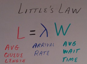
")
")
 The title of this post contains an answer and a question. However, it’s a “question” that prompted the answer part of this title, and my recollection of how both came to me originally, that I’m interested in sharing in this post and hope you find interesting if not amusing. As for providing an “answer” to the question part of this post’s title, that I’ll leave entirely to you.