
You are only fooling yourself if you don’t think there’s a high degree of uncertainty about the best path forward.
In these times, alternatives and opposing opinions on the problems and solutions surrounding the pandemic need to be heard, not silenced.
While COVID-19 presents us with a particularly thorny case of decision making based on scientific uncertainty, this issue is perennial in science.
– Peter Attia, M.D., “The importance of red teams”, May 24, 2020
My interest in writing this post
Over the years I have spent a fair portion of “free” time learning about predictability and uncertainty through randomization-based inference data analysis. In particular, from works by Dr. Sam L. Savage (author of “The Flaw of Averages”), Douglas W. Hubbard (author of “How to Measure Anything” and “The Failure of Risk Management”), and Dr. George W. Cobb (author of several statistical textbooks and papers advocating for these inference methods – see “The Introductory Statistics Course: a Ptolemaic Curriculum?”). And a bit more recently about process behavior charts from works by Dr. Donald J. Wheeler (author of “Understanding Variation: The Key to Managing Chaos” and “Making Sense of Data”).
What draws me to their works is a common theme that aligns with my study of “lean thinking”, which has influenced my learning approach. That is, start with existing insights from what I already know and understand well about a problem or question, add some fundamental analysis concepts and learning tools that I can grasp relatively quickly, and then practice (every chance I get) with them to develop my skills and capability to effectively and efficiently guide the next most valuable learning efforts, identify economically worthwhile continuous improvement opportunities, and enhance the decision-making process used to support or supplement my intuitions (experienced recognition).
This emphasis on creating an experiential foundation to build on, to first gain deeper insights into essential concepts of statistical inference and experimental design, I have found to be very helpful. Here is a recent example.
A simple message found often in Dr. Wheeler’s books and articles is “No data have any meaning apart from its context.”1 The deeper significance related to data analysis only truly “hit me” after I used a spreadsheet to duplicate a few simple experiments he suggested, and then extended and explored a bit further based on what I found. That experience provided insights into the significance behind this humble statement that reading alone had never provided me. From those insights, I now see why I might want to validate a very key assumption prior to using any theoretical probability distribution or any data analysis that uses them (but that is another story for another time).
As an added bonus that I did not anticipate, I also now realize more why Dr. Savage also for some time has been expressing the depth of learning from these types of experience as “Connecting the Seat of Intellect to the Seat of the Pants.”2 That is, a depth of learning that occurs when intellectual (explicit) forms of learning are combined (connected) with experiential (tacit) forms.3 And while that too is another story for another time, it provides the context behind the motivation for this post.
Today’s focus and the data used
Today, I want to share a little from my recent practice with a process behavior chart (PBC) to help me look deeper into Colorado’s COVID-19 data, which has obviously been on a lot of people’s mind lately, including mine, and rightly so. Specifically, I was curious to see how the PBC might help me better understand something about the virus’s spread and the effectiveness of some of the broader responses to it here in Colorado. In particular, what I could learn beyond the charts I found available on the state’s web site.
As I began this effort, one of the first things I observed was the state’s data was being updated throughout the week, including revising data up and down for earlier days and weeks. So, if you visit the state’s site to inspect a given date on my PBC below, expect to see small differences and some shifts of some peaks by a day or two in either direction. However, after updating my PBC over the last few months with this data, I believe there is a“story” about COVID-19 in Colorado that remained relatively consistent even as the updates were made over time.
The three charts I have been practicing with since early March are the following:
- Daily Reported Cases
- New Hospitalizations
- New Deaths
For this post, I will focus on New Hospitalizations because at this time it appears to be the most interesting in terms of providing insights about Colorado’s responses. However, I will say just a bit here about the other two before moving on to New Hospitalizations.
Initially, I was expecting to see what was happening with Daily Reported Cases feed into expectations for New Hospitalizations and in turn feed into expectations for New Deaths. However, I quickly learned that due to the types of testing that were possible early on and/or the way testing was implemented (ex. testing focused on those with symptoms only), I did not see a clear connection to the other two charts. However, after a little research about the modeling that has influenced the responses in Colorado, I understand why redirecting some testing would be helpful (and needed).4
As for New Deaths, it was well established early on that the greatest risk was for specific population segments (ex. those above 70, in long-term care facilities, and/or with existing medical conditions exacerbated by Covid-19).5 I also found that the stages identified on my New Deaths PBC align quite well with those on my New Hospitalizations PBC. As expected, they show much less significant swings in variation reflecting the lower COVID-19 death rate relative to related hospitalization admissions, and even with some (very) small offsets in time (if I look closely) that to some lesser degree are due to how deaths lag admissions (I am assuming).
While I look forward to seeing how testing continues to improve insights about the infection spread (R0) and the broader infection fatality ratio (IFR) in contrast to the case fatality ratio (CFR), here is some of what I have learned, using a PBC, about how Colorado’s broader responses “flattened the hospitalization curve” to reduce the risk from exceeding the state’s medical capacity.
New Hospitalizations
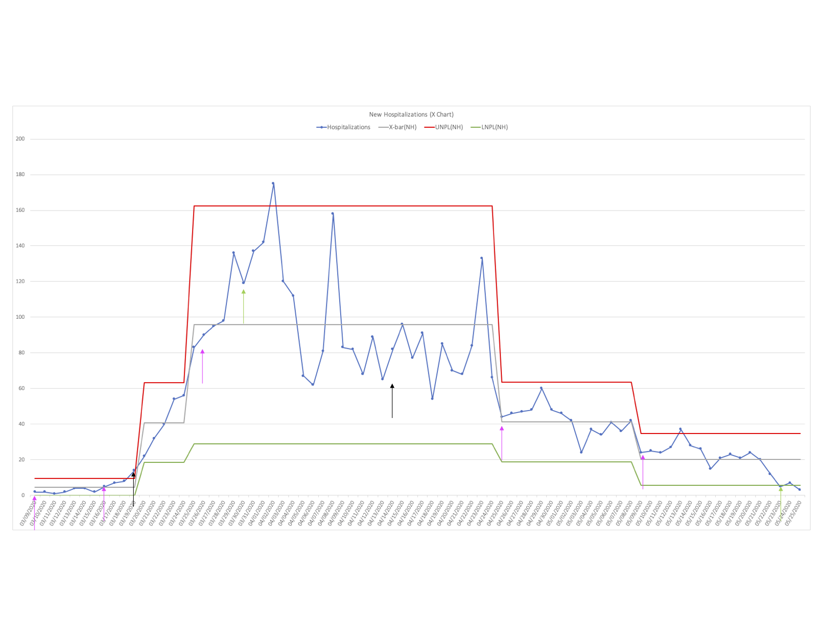
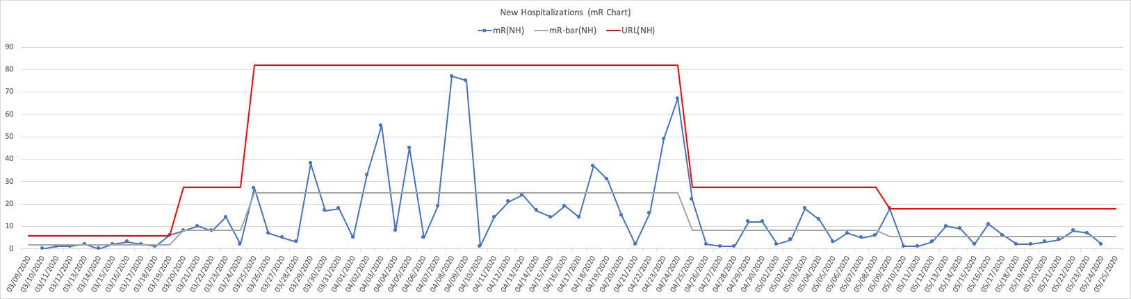
For those new to PBCs, I have opted to use an XmR Chart, which consists of an individual values chart (X-Chart) and a moving range chart (mR-Chart). These charts were created using data from the New Hospitalizations bar-chart on the state’s web page that showed cumulative daily new hospitalizations. (Note: elsewhere on the state’s web site another chart displays daily hospitalizations as a run chart, but not as far back, and with numbers differing slightly.) Here I will limit the focus to the X-Chart which in this case is sufficient on its own for the purposes of my post. I include the mR-Chart at the end of this post for those interested.
Click here to see image full-size
The Hospitalization (blue) line is simply the state’s data converted to a run chart form that clearly visualizes the daily swings (variations) of COVID-19 related new hospitalizations over time (early March to late May). The X-bar (grey) line represents the average daily new hospitalizations, in this case on a stage by stage basis that I discuss further below. The UNPL (red) line and LPNL (green) line are the upper natural process limit and lower natural process limit respectively, again on a stage by stage basis.6
These limits are key, in particular, understanding how to create them correctly, and perhaps more importantly understanding deeply why you need to create them this way (and why they work, and as with any tool, when they do not). In short, these limits help effectively identify the most economically favorable “signals” (events over time in this case here) where further investigation is warranted and worthwhile.
Along with the X-Chart, the specific rules for detecting the signals, and the context of what I learned about specific actions by the state’s businesses, schools, cities, counties, etc., I worked to identify in my judgment “noteworthy points” on the chart from these efforts. I believe six distinct stages emerged over time that characterizes some of what occurred with COVID-19 related new hospitalizations in Colorado from early March to late May. For each stage, I share some thoughts and questions I felt might help me exercise my decision-making thinking, based on context, quality of information, uncertainties, risks, and valid options (available at the time a decision is made, not after the fact). The practice here has certainly helped me gain a deeper appreciation for those who had the enormously difficult challenge of deciding how to respond early on (and now going forward) to the risks COVID-19 presents.
Stage 1
Colorado’s first two established presumptive positive cases were on 03/05/2020 with both individuals having recently traveled from separate locations outside of the state including one abroad. Another six cases identified on 03/06/2020 increased the total to eight with seven having recently traveled abroad.7 Learning that COVID-19’s average incubation time is 5.2 days, the 95th percentile for symptoms appearing is 12.5 days, and the average time between the onset of illness and being hospitalized is 12.5 days, I can see how this seemingly small foothold, likely established a week or weeks prior to these dates, set the stage for the spread and the spike in hospitalizations that followed.8 And this was also likely compounded by a later established fact that for many the infection is asymptomatic or only produces mild symptoms not immediately or ever attributed to COVID-19.9 While my chart starts on 03/09/2020 (1st pink arrow), reflecting the state’s available data, my take is Stage 1’s daily average of 4.5 new hospitalizations, and the PBC limits ranging from 0 to 10 hospitalizations per day seemed a reasonable and fairly stable predictable expectation over a 14 day period from the initial cases on 03/05/2020.
However, I also knew what was happening elsewhere in the country and the world by 03/09/2020. A few colleagues here in Denver told me their workplaces were not allowing outside visitors, and internal meetings were being limited to 20 participants maximum. And my son’s high school, along with the school district and many other larger districts in the state, moved to at home online schooling during the week of 03/16/2020 (2nd pink arrow).
That week was also spring break for a number of the state’s colleges and universities, like the one my daughter attends (with many of these students at home then). A number of these schools moved to online schooling (for a majority of the students) as well the week after spring break ended. The week of 03/16/2020 was also when most of my other colleagues here in Denver told me their workplaces were going to work from home (WFH) optional, and then mandatory the following week.
It is understandable, due to COVID-19’s incubation lag time, the lag between illness onset and hospitalization if needed, and it being often asymptomatic or causing only mild symptoms, that detecting any benefits from these initial actions themselves toward flattening the hospitalization curve was unlikely to be seen in Stage 1. However, I am guessing a number of parents of younger school-age children started working from home (WFH) even before their workplaces made that mandatory, and these actions were at least a week sooner than the state’s official Stay-at-Home order on 03/26/2020 (3rd pink arrow). Did these initial actions, prior to the state’s Stay-at-Home order, contribute to flattening the new hospitalizations rate? Does the X-Chart provide any insights, albeit after Stage 1, that supports looking at this further and into how this helps as Colorado moves beyond Safer-at-Home or if we see the daily new hospitalization rate rise again toward an unacceptable risk?
Stage 2
I believe the first “clear signal” indicating COVID-19 related daily new hospitalizations were to likely increase from Stage 1 came on 03/19/2020 (1st black arrow). However, the actual “change event” itself looks like it started on 03/16/2020 (2nd pink arrow), followed by 13 consecutive additional increases, the first increase being +5, and the last being +136. Clearly Stage 2 exploded Stage 1’s average and limits, as Colorado went on a wild ride that landed it in a whole different world for COVID-19 daily new hospitalizations.
While the last increase of this run was on 03/29/2020, my take is Stage 2 actually ended on 03/24/2020, and without the benefit of a similar clear signal that had marked Stage 1’s end. I acknowledge these are judgment calls based on what I see in the charts beyond this point and which I will cover shortly. However, before moving on to Stage 3 it is more important to understand these computed “average and limits” visualized for Stage 2 are really meaningless in terms of providing any valid predictive capability. For what it is worth they are “descriptive” of a process that was changing rapidly every day for about 5 to 6 days from 03/19/2020 to 03/24/2020, and that is it.
So why even display the average and these limits here or this stage for that matter? Stage 2 represents a state of an unstable system, a “transition state” where the average is essentially continuously changing over this time, where the “variation” in this case is only up, ever-increasing. Even when a process is stable, Dr. Savage’s (Flaw of Averages) work shows many of the pitfalls from estimating, modeling, or forecasting using an average alone (a point estimate). Imagine now the pitfalls from using an “average” (or any supposed limits) derived from a period of time when the process was known to be “unstable” and then trying to forecast or predict. This stage provides insight into the challenges, perhaps impossible to overcome, that modelers faced when in late March the “best” models were projecting 100K – 200K (best case) to 2.2M (worst case) COVID-19 related deaths in the U.S., an 11X best-worst case difference.10 Note: the “good news” in our context is as of 06/01/2020, there were 105,850 COVID-19 related deaths listed on Google News for the U.S. (more on this in Stage 3).
In Colorado, by the end of Stage 2 (03/24/2020), the only thing clear from the X-Chart regarding the daily new hospitalizations rate was it had shot (projected) right past 18.5, past 40.8, and past 63.1, just over 14X the average rate that it “appeared” to be only 5 to 6 days ago. In Stage 2 there was no simple single meaningful average number possible and providing any “reasonable” range was a “shot in the dark.” Hence, why “flattening the curve” was already the focus then. And it also helps me understand why the limited testing available was focused on people with symptoms only, not then on those without to explore further the IFR, but rather at that time to enable effective contact tracing and case isolation.
When a pandemic process is in a “Stage 2-like” state, where the “average” of a critical risk metric is only increasing over time, ironically it simplifies making decisions due to limited options. That is, it is likely a good strategy to first focus on stabilizing the system.
If by chance you are interested in predictable product or service delivery workflows, do you see how this might link, pun intended, to understanding and addressing ever-increasing lead times?
Assuming the tests existed then, or now, did the X-Chart provide any insights, again albeit later, on how soon after 03/24/2020 (my judgment call on Stage 2’s end) it might be reasonable to consider directing some testing to further solidifying what is known about COVID-19’s IFR to improve the modeling?
Stage 3
Recall, earlier I pointed to no clear signal on the X-Chart for the end of Stage 2, and also noted the run of 13 consecutive increases in new hospitalizations, that started well before the end of Stage 1 and ended well after the start of Stage 3. What about the first break in the run of increases that occurred on 03/30/2020 (1st green arrow), 6 days into Stage 3 according to the boundaries I have decided upon? Technically, based on the rules for detecting signals with the limits for this stage that I settled on days later, this point alone is not a “signal.” Obviously, it was “nice to see”, especially in a pandemic context. However, in the context of what I had learned about COVID-19’s incubation, the lag between onset and hospitalization admissions, and the earlier responses in Stage 1 by businesses and schools, seeing anything around the timing 03/30/2020 of that first decline as a good thing is “reasonable wishful thinking”, if there is such a thing.
If this was a boxing match, in my judgment, based on the rest of Stage 3, that first decline was the earliest possible “experienced recognition” that the state’s earlier efforts in Stage 1 (early to mid-March) did land some solid blows to COVID-19’s daily new hospitalization rate. From there through 04/25/2020 (4th pink arrow), where I think Stage 3 ended, it was clearly a wild ride with back and forth punches landing, and that high point on 04/02/2020 was, in particular, a scary punch to see. Essentially, that peak was a strong signal, exceeding Stage 3’s upper limit, again limits that I have identified based on interpretation of my knowledge and understanding of the context.
But rather than worse things to come, my take is this “signal” provided me insight into the momentum COVID-19 generated coming into this stage setting up the wide variation displayed as this fight continued. However, that run of 14 days from 04/09/2020 to 04/22/2020, that were below (or close enough to) Stage 3’s average, showed a weak but sustained signal that Colorado was also taking over this fight on points (punches landed, not by knockout), and my take again likely due to what the state did in Stage 1 and now supported by the Stay-at-Home order that came after on 04/09/202 (3rd pink arrow).
Another point of interest I want to call out here, that I learned later from another of the state’s web pages, was the total number of people being hospitalized at a given time (not cumulative, not the daily admissions) in Colorado for COVID-19 peaked on 04/14/2020 (2nd black arrow) at 888.11 From the perspective of the state’s initial primary risk, my take is the uncertainty associated with exceeding the medical capacity was greatest between the two black arrows.
At the start of Stage 2 03/19/2020 (1st black arrow), the uncertainty and risk associated with new hospitalizations were racing up. But, by 04/14/2020 (2nd black arrow) when Colorado hit the peak number hospitalized at a given time, I believe the X-Chart shows the state was on its way toward gaining control of the fight, and correspondingly the number hospitalized at a give time trended downward as well on the state’s other run chart.
This decline in the number hospitalized at a given time was not due to more deaths. Not shown here is the New Deaths PBC as I mentioned earlier to limit the scope of this post. However, the timing for the New Deaths X-Chart’s highest stage aligned well with Stage 3 here. From there the next two stages for New Deaths declined in a similar fashion as New Hospitalizations.
What If?
I will say upfront this is more an interlude for me at this point to exercise a few “what if” thoughts that hit me based on what I felt I had learned so far up to Stage 3. Feel free to skip right over this section. I concede this is a lot of “off the cuff” conjecture that needs a more complete modeling effort on my part. For the moment, it is a “stick-figure” to come back to when time permits.
As of 06/02/200, the state’s web page displaying the total number hospitalized at a given time, showed the total critical care (cc) ventilators available at 1,089, with about one-third (33%) currently in use as of 06/02/2020. However, on 04/14/2020 (2nd black arrow), when Colorado hit the peak number hospitalized at a given time at 888, it had 1,145 cc ventilators available with 464 in use (41%). This works out to 52% of those hospitalized at that time needing ventilators then. And 52% of 2,200 hospitalized at a given time needing cc ventilators means roughly all available then would have been needed assuming not too many more were lost during the need for them.
Assuming Colorado’s businesses and schools didn’t start WFH and online at school at home when they did back in Stage 1, which I believe was critical to do, what is a “reasonable” rough guess at when the state might have come close to exceeding their cc ventilators using what I learned so far?
First, knowing the 888 total hospitalizations on 04/14/2020 (2nd black arrow) resulted from an earlier time due to the average lag of 12.5 days from illness onset to hospitalization, this puts the daily new hospitalizations rate of interest close to that first decrease (1st green arrow), and more importantly close to that preceding run of 13 consecutive increases. Remember, I believe the Stage 1 responses were significant, the timing to the first decrease is not unreasonable based on that, and the timing of the peak number hospitalized (before declining) lines up reasonably well too from these. So, it seems reasonable to assume a daily new hospitalization rate of 337 would likely generate 2,200 hospitalized at a given time (2,200 / 888 = 2.48 -> 136 x 2.48 = 337). If so, how many more days of increases beyond the 13 would have needed to pass before getting to a daily new hospitalization rate of 337?
Second, knowing there were 13 straight days of increases from mid-Stage 1 until that first decrease in the daily new hospitalizations rate, it seems reasonable the increases would have continued unabated. My son had just completed his high-school Algebra II, and we used this opportunity to revisit his earlier work with a challenging “real world” example. After refreshing what he had learned recently, he used the 13 points of straight increases to create an exponential model. The model was not exact for these points but provided what I believed would be a “reasonable” growth rate. It showed it would have taken only 3 to 4 more days to reach the neighborhood of a rate at 337 for daily new hospitalizations.
Again, this is a rough projection on my part, using “averages” no less, and an oversimplified model for the moment. And the analysis appears unbelievable at first. However, the X-Chart shows even after the first decline that broke this run, the daily new hospitalization rate had the momentum to increase over the next three days hitting that scary peak at 176. Then, even after getting hit by Stage 1’s early responses, it “bounced” back up to 158, and again to 133 before eventually giving in (for now). These bounces don’t appear to be due to the businesses and schools swinging back and forth from WFH and school at home to “normal.”
My take is these bounces support just how strong the COVID-19 daily new hospitalization rate was racing up during Stage 2 and into Stage 3, and just how crucial the state’s responses with businesses and schools were in Stage 1. At the minimum, this “first swing” at a quick “What if” begins a process that provides me some “seat of the pants” insight into the visualization of a pandemic’s “exponential growth” occurring in Stage 2 really looks like and feels like. I believe it provides me additional insights into why the average and limits on the X-Chart are meaningless from a predictability perspective while the run chart (line) is in a state of consecutive Stage 2 like increases, why the magnitude of variation in Stage 3 while this fight truly went back and forth, and why the modeling provided such dramatic ranges for U.S. COVID-19 deaths that would be projected by the daily new hospitalizations range as a leading indicator.
To be clear, I also understand this is practicing with a number of basic tools, and with a very challenging real-world example.
Stage 4, 5, and 6
I think by late April the last three stages (4th and 5th pink arrows, and 2nd green arrow) on the X-Chart speak for themselves. Clearly the state’s Stay-at-Home order kept the gas pedal to the floor, reducing the variability that was shown in Stage 3, while also accelerating the time frames for detecting benefits from the responses. And looking at the overall picture of the X-Chart, there is no missing the significant and clear observation of COVID-19’s potential and why it poses a tremendous challenge.
While Stage 1 looks innocent enough, Stage 2 took only 5 to 6 days to jump to Stage 3. Then it took the state 60+ days and some significant non-pharmaceutical interventions, that actually started prior to the Stage 2 start date, to get the daily new hospitalization rate back to levels near Stage 1’s average and limits. The magnitude and length of Stage 3 (and subsequent stages) would surely have been worse without the early actions by businesses and schools in Stage 1, before the broader Stay-at-Home order that started in Stage 3. It clearly demonstrates the power of exponential functions related to a pandemic, and for saving. Staring early (even if it seems it is only in small ways) goes a long way!
Wrapping up
Now, I want to revisit my earlier question related to how soon it might have been reasonable to shift testing toward better understanding the IFR, if it was even possible to do so, to improve modeling efforts. With hindsight being 20-20, perhaps a gutsy call would be 04/08/20202 (that “huge” valley in Stage 3), not long after Stay-at-Home order was started. But in the middle Stage 3, without “perfect” information after the fact, I do not think I would have made that call. Maybe by 05/04/2020 or a bit earlier, though I know these stages were not identified instantly on any one specific day, like the start dates currently shown for each of them. However, if I consider the state’s total number of people being hospitalized due to COVID-19, by the time 05/04/2020 came around that run chart displayed a nice downward trend. It would have been nice to have an X-Chart for that data (hospitalizations on a given date), but I was unaware of it until well into the other three charts and writing this post.
For one last fun comparison, I noticed the earlier reference by Peter Attia’s “COVID-19: What’s wrong with the models?”, was dated 04/20/2020. In this article Dr. Attia makes a reasonable case, that by that date of 04/20 it was already a good time to shift the focus on testing, if not even a bit sooner, based on two likely scenarios he proposed, and to some extent due to the limits of models that he highlights. So, it looks like my thinking, for a call to shift the focus of testing on 05/04/2020, is at least two weeks behind his thinking. But, hopefully, with a little more practice on my part, I can catch up to his thinking :). So, that gets me back to the first paragraph of my post, perhaps one step further, but still two weeks behind. All I need now is more “free” time to practice.
Take care,
Frank
P.S. – just prior to finishing my post here I came across another article related to Colorado’s COVID-19 data using PBCs here. This one was published a month earlier and of course, I found it interesting to read after I had written mine. There are similar concerns shared with using a PBC to look at this data, and I too acknowledge those concerns. However, I too feel there is something useful in terms of what I have learned from this practice, about COVID-19, the state’s responses, PBCs and using them to look at data, even during the time of a pandemic, working to see how any strong and weak signals might relate to observed and known events. And yes, acknowledging very much that judgment is needed, which only gets better with practice, and must consider the context of the data.
UPDATE 06/08/2020: After publishing my post, I came across an article titled “Lockdowns prevented nearly 5 million U.S. coronavirus cases, study says” (CNBC.com)12. My sense is this broader study supports what I see from my analysis of Colorado’s COVID-19 data. Those initial responses in early March, prior to the state’s Stay-at-Home order, by the businesses and schools, appear to have been significant in helping to “flatten the curve.” And as it also suggests, it is hospitalizations (and subsequent deaths) that are the keys to weighing the benefits of these early responses, not just confirmed cases.
References:
1 “Making Sense of Data”, pg. 191, Donald J. Wheeler, SPC Press, 2003
2 “The Flaw of Averages”, pg. 35, Dr. Sam L. Savage, John Wiley & Sons, 2009, 2012
3 “The Knowledge-Creating Company”, pg. 8, Ikujiro Nonaka and Hirotaka Takeuchi, Oxford University Press, 1995
4 “COVID-19: What’s wrong with the models?”, PeterAttiamd.com, April 20, 2020
5 “The impact of the COVID-19 pandemic on older adults”, MedicalNewsToday.com, May 19, 2020
6 “Making Sense of Data”, pg. 99, Donald J. Wheeler, SPC Press, 2003
7 “COVID-19 pandemic in Colorado”, Wikipedia, retrieved 05/29/2020
8 “Tracking COVID-19”, pg. 2, Donald J. Wheeler, Al Pfadt, and Kathyrn J. Whyte, Quality Digest, April 6, 2020
9 “How does the new coronavirus compare with the flu?”, LiveScience.com, May 14, 2020 update
10 “Dr. Birx predicts up to 200,000 U.S. coronavirus deaths…”, CNBC.com, March 30, 2020
11 “Currently hospitalized run chart”, covid19.colorado.gov/hospital-data, retrieved June 01, 2020
12 “Lockdowns prevented nearly 5 million U.S. coronavirus cases, study says”, CNBC.com, June 08, 2020